That’s not an image, it’s HTML text with real fonts provided by Typekit and embedded via CSS @font-face. You can see the actual thing here: Nice Web Type likes Bello and Proxima Nova.
Underware’s Bello Pro sure makes this example look great, but until Typekit is out of technology preview you’ll have to try this technique with a different typeface. (If you do, comment here and link it up!)
Follow along or skip to the final result.
The markup
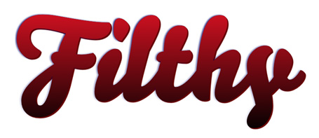
Filthy
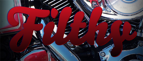
That’s it for the type effect. You can have it sit on top of any background you like by placing this h1 inside of a div and giving the div a background (in my example, I used a closeup of motorcycle chrome).
The style
There are actually four HTML items we’ll be addressing with CSS:
- The
h1element - The
text-shadowof theh1element - The
aelement inside theh1element - CSS-generated content that lives in the
h1element, beside thea
Style the h1
The first thing we’re going to do is style the h1 so that it takes up a good amount of room. Here’s where you specify the typeface you want to use for the effect. Choose something thick enough that folks will notice the gradient, and something with rounded edges will help simulate the 3D effect of our text-shadows.
h1 {
font-family: "your ideal typeface", Verdana, sans-serif;
font-size: 300px;
line-height: 300px;
text-shadow: -3px 0 4px #006;
}
h1 a:link,
h1 a:visited,
h1 a:hover,
h1 a:active {
color: #d12;
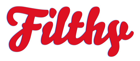
}Nudge this text-shadow away from the text just slightly. It ends up looking like a neon glow, and you want it to have a touch of finesse. It’s not the main effect. Then, style your a element with the color you’d like to use for the top of your text gradient.
Fading this into nothingness
Now comes the cool part: applying a mask using the CSS mask and CSS gradient properties in Apple Safari (Webkit).
h1 a:link,
h1 a:visited,
h1 a:hover,
h1 a:active {
color: #d12;
-webkit-mask-image: -webkit-gradient(linear, left top, »
left bottom, from(rgba(0,0,0,1)), to(rgba(0,0,0,0)));
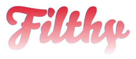
}-webkit-mask will accept a whole bunch of different things, including images. We can use a -webkit-gradient value as a mask because it is technically an image. RGBa color allows us to fade from full alpha-channel opacity to none (transparent alpha channel).
Fading into a different color
You’d think you could, instead of using a mask and RGBa alpha gradient, just use the CSS gradient instead of a color value on your text. But because of what we just read (-webkit-gradient counting as an image), you actually can’t.
So to fade the color of your a element into a second color, you actually need a second copy of the word to be sitting exactly behind the one that’s fading into nothingness.
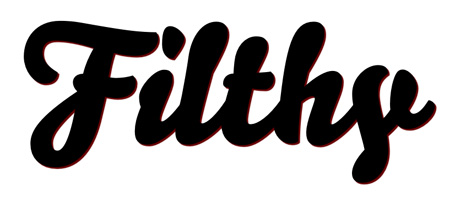
h1:after {
content: "Filthy";
color: #000;
text-shadow: 3px 3px 1px #600;
}
The only text in our markup is, “Filthy”. We could have put a second one in there, wrapped in a span, but we don’t want a second Filthy in there dirtying the markup. Instead, we use the CSS :after pseudo-selector and the CSS content property to inject our twin Filthy into the markup. This one we’ll style black and give a hefty text-shadow to simulate thickness.
Stack them
h1 {
position: relative;
font-family: "your ideal typeface", Verdana, sans-serif;
font-size: 300px;
line-height: 300px;
text-shadow: -3px 0 4px #006;
}
h1 a:link,
h1 a:visited,
h1 a:hover,
h1 a:active {
position: absolute;
top: 0; z-index: 2;
color: #d12;
-webkit-mask-image: -webkit-gradient(linear, left top, »
  left bottom, from(rgba(0,0,0,1)), to(rgba(0,0,0,0)));
}
By relatively positioning the h1 and absolutely positioning the a inside, as Doug Bowman once showed us how to do, plus adding a touch of z-index, one can be stacked neatly atop the other.
Now just pop that into a composition you’re working on.
The final result
HTML:
Filthy
CSS:
h1 {
position: relative;
font-size: 300px;
line-height: 300px;
text-shadow: -3px 0 4px #006;
}
h1 a:link,
h1 a:visited,
h1 a:hover,
h1 a:active {
position: absolute;
top: 0; z-index: 2;
color: #d12;
-webkit-mask-image: -webkit-gradient(linear, left top, »
  left bottom, from(rgba(0,0,0,1)), to(rgba(0,0,0,0)));
}
h1:after {
content: "Filthy";
color: #000;
text-shadow: 3px 3px 1px #600;
}
So there you have it. A pure CSS text gradient with no PNG images necessary. Of course, it only works in Safari … but Safari is the way of the future. Get your mind into techniques like this now, and you’ll know the logic when other browsers catch up.
See this technique in action:
Nice Web Type likes Bello and Proxima Nova
UPDATE: the CSS content property doesn’t translate.
No comments:
Post a Comment