The new year is here and you have made a resolution to give Linux a try. A noble resolution and one that will be met, initially, with much confusion. Why? Linux isn’t like Windows where your choice is limited to a single release with different features (depending upon how much you want to spend) or OS X where you have no choice but to take what Apple gives you. No. Linux has a multitude of choices. In fact, if you go to Distrowatch you will see at least 100 distributions listed in the page hits ranking section. Think about it, 100 different versions of Linux. And that’s not all of them. There are many more variations out there, and more coming every day. And then, you add into the mix the enterprise level distributions that not only come with a price, but support, and the ever-staggering number continues to grow.
So how does a new-to-Linux user decide? With so many choices, how is it possible to start off on the right path? Without help, it’s not easy. My first Linux distribution was Caldera Open Linux 1. It was rough and nearly pushed me back to Windows. It wasn’t until I found Red Hat (4.2 at the time) that I found the right distribution for the right purpose. That was ten years ago and the choices were much more limited.
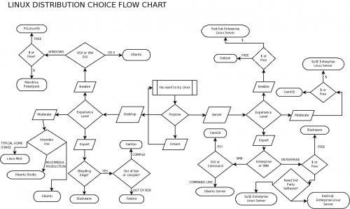
Because the new year is here, and I am always one to want to help people make the move to Linux, I thought I would create a flow chart to help Linux users make the right choice. Is it perfect? Probably not. Do I include every possible choice? No way. The distributions I have included are:
- Ubuntu
- Ubuntu Server
- Ubuntu Studio
- Slackware
- Fedora
- Red Hat Enterprise Linux Desktop
- Red Hat Enterprise Linux Server
- SuSE Enterprise Linux Server
- SuSE Enterprise Linux
- Gentoo
- Mandriva Power Pack
- CentOS
- PCLinuxOS
- Linux Mint
- Debian
It’s still a healthy list of distributions, but not everyone. And I’m sure there will be those that disagree with my approach. That is understandable. So much so, that I am (in the spirit of open source) including my .dia file for the flowchart. NOTE: The .dia file is hosted on my domain (outside of ghacks). I would love to see how readers change my flowchart to better fit their opinions/experiences.
But for those that do not want to bother messing with editing the flowchart, and just want to see it in all its scattered “glory”, take a look at Figure 1.
One of the first things you might notice is the predestination paradox (temporal causality loop) I created for those unsure of their purpose for choosing Linux.
There might also be some initial confusion as to why I have included, in some choices, distributions that are rather similar. For example: The difference between Mandriva and PCLinuxOS might not be that great, but notice I have included the Mandriva Power Pack which includes pre-installed flash, various codecs, and Mandriva support.
Final thoughts
I hope this flowchart makes your choice of Linux an easier one. Even more, I hope this flow chart helps you to start your new year off on an open source foot, and that you find this path a rewarding one.


